In this lesson, there were a lot of concepts that I had to practice, so here’s a quick summarized explanation. Between this text is the final product.
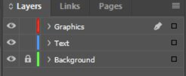
In the beginning, I learned about the layers in InDesign and how they work like stacking. There are ways to stack layers of your work to place them in a certain order. In the image above, The bleeding hearts image was moved to different sections of the layers panel. The background of the newsletter was moved to the background layer in the layers panel while the other text and images were moved to the other layers. This helped to section each part of the work out to keep an organized workspace.
Next, I had to learn about reshaping text frames, and in order to modify a text frame and edit one, you can use the direct selection tool and line the text boxes up with different guides you create. In this section, I used the direct selection tool to pull different handles out and used the Convert Direct Point Tool to change anchor points. This is very effective and useful when wanting to change the layout of a text frame.
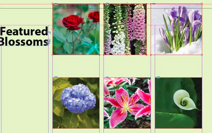
During this section of the lesson, I learned how to place multiple graphics into grid frames. To accomplish this, I selected all of the pictures, then dragged and placed them into the given frames. To make them fit proportionally in the grids, I held shift and pulled the horizontal/vertical anchor points to make the images larger and fit better. The other way to make the images fit was to choose Object < Fitting-Fill Frame Proportionally to make the process go a little faster.
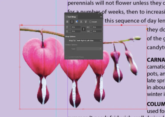
The next section was text wrapping that I had learned as well. There are different ways to use the text wrap panel to change the text’s appearance around objects and shapes. The different options in this panel allow you to put the objects in front, behind, to the side and change the looks altogether. Furthermore, it also allows for you to layout projects better and puts a more put together way of the text. Instead of your image being placed to the side and out of sight, this is a helpful way to maneuver more efficiently with texts and graphics

Finally, I learned in the last section of this lesson is how to apply alignments and size changes to graphics. There are multiple pictures lined up on the left side and I used the Align panel to take the scattered images and line them up. I specifically used Align Right Edges to complete this. The scaling portion was just dragging the anchors to increase the sizes and aligning the pictures neatly. Even though this section wasn’t the most difficult, it was very significant to understand since aligning will be used a lot in most projects.
