Today, I set up parameters and measurements to understand the inner parts of a document.
3 parameters on an artboard
To begin, head to the File menu at the top right of the screen, then choose New. Inside the dialog box, set the bleed values to 20 pt then click OK. After creating the new document, head to the View menu and select Show Print Tiling and Hide Artboards.
Once a document is opened, there’s a tab with its listed, unique information. For example, if tab read as Untitled-7 @ 76% (CMYK/Preview), then it’s unnamed with a 76% magnification with color mode.
Going back to the document, there’s 3 squares that are dashed and bolded around the artboard. The innermost set of lines represent the actual printable area, the second being paper size, the third is the bleed region.
In this lesson, I learned how to effectively create a new document inside Illustrator.
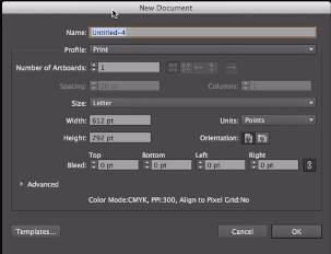
New Document Dialog Box
Creating new documents is a frequent activity in Illustrator, so it is important to understand the options when it comes to creating new documents.
At the very top of the screen, you can see File, and when opened, you can click New (Ctrl + N, Command + N). Once clicked, the new document dialog box will open that includes a list of options. You can name the document, customize size and profile, set up multiple artboards, and change the measurement and bleed, the part on the side of a document that gives the printer a small amount of space to account for movement of the paper.
Additionally, there is an advanced option which includes color mode and raster effect, which are altered depending on the type of profile. When you’re working on an on-screen delivery profile like web and mobile devices, make sure that the Align New Objects to Pixel Grid box is checked to avoid blurriness when exported.
In this lesson, I learned what Isolation Mode is and how it works.
Mountain part in isolation mode
Isolation mode is used to edit objects or paths within a sublayer, compound path, group, or symbol. When Isolation Mode is entered, anything not within the isolated object will appear dimmed out.
To get to Isolation mode, you must double-click a part of the grouped object. It can be edited on that mode, but when you double-click again, only that part appears. To get out of Isolation Mode, you can click step by step a Back One Level button.
Today, I learned the fundamentals of selections and its tools. I also learned about the stacking order of objects and how to change the order.
Selected group of elements that makes up the car.
Squares overlapping with yellow square selected
At the top of the tools panel, which is on the left hand side of the screen, there’s a black arrow (Selection Tool) and a white arrow (Direct Selection). With Selection Tool on, when you hover your mouse over the car, different paths are highlighted. This is useful for finding the individual outlines in an object and how it is created.
It is not uncommon to move all the elements that make up an object, so in order to do that, you must group them together by going to Object > Group or Command + G on Mac or Ctrl + G on Windows. With Selection Tool enabled and using that to click on the car, the entire object is highlighted, making it so you can click and drag it without losing a part.
When a certain aspect of the object is needed, that’s where the Direct Selection Tool comes in handy. Once it’s hovered over the object, it highlights its individual parts and anchor points. When you’re not hovering over a specific anchor point and you click, it selects the entire path, which can be moved by itself. However, if you click on an anchor point, the path is highlighted but only that point is selected.
Furthermore, these selection tools are easy to toggle back and forth as well. If you hold down the Command key on Mac or the Ctrl key on Windows, the arrow switches to black and vice versa.
Objects also have a stacking order that associate with them. To look at the stacking order, you need to head to the Layers panel on the right hand side of the screen. You will notice that each object is top of one another and that order determines which objects overlap other objects. For example, the picture with the squares above are in this order: Blue > Red > Yellow, and judging by the picture, the blue square is the top most object in the order since it overlaps both red and yellow.
There’s two different ways that the stacking order can be changed. You could either go into the Layers panel, click on a particular sublayer, and drag above or below other sublayers, or head to Object menu at the top of the screen, select Arrange, and choose the options given (Bring to Front, Bring Forward, Send Backward, Send to Back). If you choose either Bring Forward or Send Backwards, it will move one step in the sublayers. If you choose either Bring to Front or Send to Back, it will move to be at the top of the stack or at the bottom.
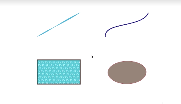
During this video, I worked on different types of strokes and fills and where to find and apply them.
To start, the fill function allows you to cover a large space of your image with a solid color or pattern and the stroke command makes it easy to paint borders around whole images or within them.
When the path is selected, the fill and stroke settings appear in the control panel above the artboard. By clicking the arrow in the box to the left of Stroke, a wide range of colors, gradients, and patterns appears, and in the top left corner, there’s a none option. When clicked, the path disappears, but its anchor points still exist. If you have trouble finding the path, simply click and drag a marquee around the general area, selecting and highlighting the path.
Going back to the stroke box, the same color panel appears, and when a color is selected, the path will change to that color. To the right of Stroke, there’s a box that has 1 pt (point) labored which changes the thickness of the path. When clicking the arrow next to the box, a list of selected points appears, making it a quick access feature. By clicking on each of them, the path changes its size whether it be thick or thin determined by the pt measurement. Usually, the bigger the number, the thicker it is and vice versa.
There are some additional options as well, for example, the Variable Width Profile. When selected, the path will have a unique shape, changing the appearance of the stroke on the path. There’s also a dropdown menu which allows you to change the definition of the brush.
For a closed path, the same stroke options apply, however, a new option appears: fill. The default fill is transparent to the background, and to change that, you got to head to the box left of the stroke box. When clicked, the same color panel appears, and when a color is selected, it fills in the closed path with that color.
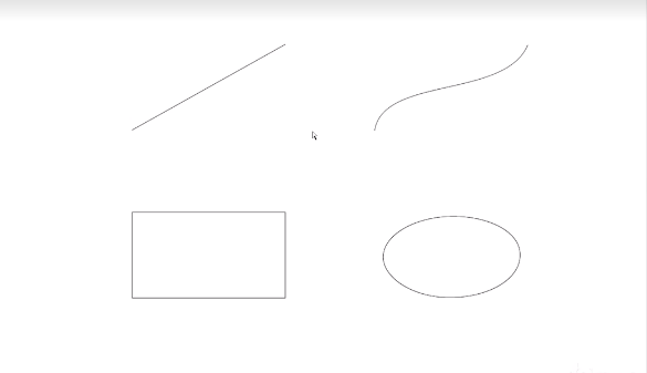
For today’s lesson, I learned about how a path is created by anchor points and the two types of paths and anchor points.
Top open paths, bottom closed paths
In Illustrator, a path means a line that can be either open, making a line, or closed, creating a shape. Each path consists of 2 or more anchor points. For example, the straight line has 2 anchor points while the rectangle has 4. When the mouse highlights the point, it tells its exact X, Y coordinate. When you click on it, it becomes a corner anchor point since it draws a straight line from the center of the anchor point to its destination, which is the top anchor point. The curved line also has 2 anchor point, however, when the anchor point is clicked, a control arm appears, dictating the direction of the path from that anchor point. It’s referred to as a smooth anchor point because it has the ability to create smooth paths.
Going to the bottom paths, the rectangle to the left has 4 anchor points, and when clicked not only highlights the point, but the entire shape. This shape was made by 4 straight lines with their respective anchor point that continued a path until it became closed, resulting in a rectangle. The oval to the right also has 4 anchor points, but they’re smooth since they’re controlling each other.
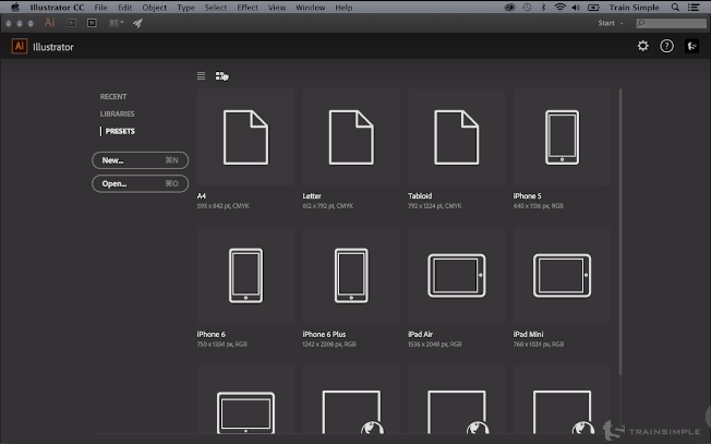
In this lesson, I learned how to set up and create a new workspace.
Workspace Presets
When Adobe Illustrator is opened, the home page is presented with the workspace options and documents on the left side which are quick access to different types of documents. These three categories include RECENT, which will display any recent files that have been worked on in the program, LIBRARIES, which is access to the creative cloud libraries, and PRESETS, which have new document presets. At the top of the screen, there’s two view icons, changing the display of the layout. Underneath PRESETS, there’s a New button which is access to a new document, and an Open button, which makes it able to browse a system for a particular document.
If the Start Workspace is unnecessary, there’s a gear icon on the right-hand side which, when clicking it, tells if you want to hide the Start Workspace, you can uncheck ‘Show Start Workspace…’ under Preferences > General. It can also be exited by choosing a different here in the workspace switcher.
Today, I learned the difference between bitmap and vector artwork and the benefits of vector artwork.
Left logo is vector-based, right logo is bitmap-based
Vector graphics are computer graphics images that are defined in terms of points on a Cartesian plane, which are connected by lines and curves to form polygons and other shapes. As a result, the finished look is crisp and clear, making it able to be as small as a business or something as large as a billboard without having to worry about degrading quality. When the size is increased or decreased, the vector points are recalculated and connected, maintaining a clean image.
On the other hand, bitmap graphics is a digital image composed of a matrix of dots which its images are constructed of little squares of color information called pixels. They traditionally lend themselves to images with great tonal range, like photographs. However, they’re only limited to the amount image. If you increase the size of the image, the pixels spread out, resulting in a lower-quality image.